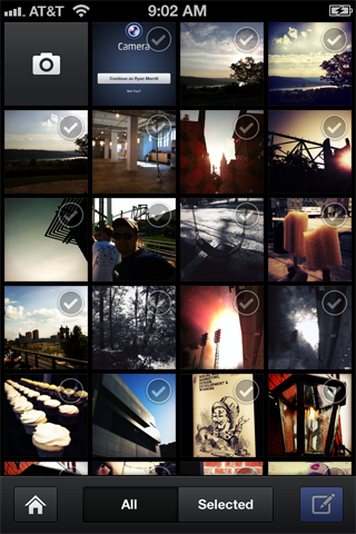
I think I just found a replacement to the official Facebook app on my iPhone. It’s the Facebook Camera app.
Released this week, the excellent camera app is one of the best designed mobile app experiences I’ve had. Not surprisingly it was designed by the insanely talented Mike Matas, who famously headed up Push Pop Press before it was sold to Facebook last year.
The camera app’s UI is intuitive, clean and simple in a way that the official app is distracting. By it’s simple nature, the app removes the pointless status updates and what-I-read nonsense that is continually making Facebook noisy and cluttered.
It’s what Facebook should be: information from my friends who I care about presented in an uncluttered format.
If this is what the mobile design team at Facebook is capable of, then consider me more than intrigued to see what they’re cooking up if the rumors of a Facebook OS prove true.


